
Rob Wilson | Principal Consultant, Greater Nashville Area | Southeast US
Connect with Rob on LinkedIn
Let’s face it: dashboards are cool. There is something particularly satisfying about seeing your data presented visually for you and others to explore. You can identify trends, spot anomalies, and satisfy your curiosity. Dashboards make you aware (information), teach you something new (revelation), or spark an idea (inspiration). But actionable insights (motivation) shared as stories are what affect change (results).
Said another way, if you want to take information to the next level, start by asking “Why?” That leads to insights. It’s nice to get value from analysis, right? If you want to take it yet another level that is perhaps more useful, ask yourself “So…what?” The response to this question leads to what is referred to as “actionable insights.” Now, share those actionable insights in the form of a narrative, and see how things change.
The concept of “Data Stories” is not as new as you may think, but it is becoming more mainstream. While the concept isn’t new, the novelty is in the tools. A recent survey from our partner Juice Analytics showed that more people still use Excel and PowerPoint for reporting data insights than Power BI, Tableau, Qlik, and SQL Server Reporting Services combined.1 That means leaders understand visualization tools are great for exploring your data and mining insights, but not great for sharing insights.
A perfect example of someone who can translate metrics into insights then into action is our president. Not that President! I’m referring to Keller Schroeder’s president Jeff Gorman. Each month, Jeff reviews our updated KPI (Key Performance Indicators) at both the company (strategic) level and with directors at the department (tactical) level. Then, at our staff meetings, Jeff doesn’t just show the charts, but also shares actionable insights for anything that needs clarification – in other words, why the data looks like it does. Finally, he concludes with a narrative of what each employee-owner can do to make positive impacts (the so…what?).
The fact that our employee-owners can almost finish Jeff’s sentences now based on the metrics speaks to both the relevance of our KPI and the clear and consistent communication of our mission. This is exactly what Zach and Chris Gemignani (founders of Juice Analytics) meant when they said in their book Data Fluency that in order to “test whether a KPI is worthwhile, we like to ask, ‘What would you do if that number changed?’” They go on to say that if it is just good information to know, or it isn’t obvious what the change would be, then “the KPI is probably more of a distraction than of value.”
Strategic planning principles dictate that the senior leadership of an organization determines the organization’s strategy, which is in turn translated into tactics at the business unit or operational level. Ideally, each contributor in the organization knows how individual contributions impact operational metrics which in turn roll up to the organizational KPI. When this level of clarity exists in an organization, good things result.
It is paramount that each contributor in the organization “knows the score,” and yet a story is much more effective and compelling than a list of numbers or a bar chart. Stories provide the context (whether good or bad; candid feedback is the goal) that motivates a person to act. Imagine receiving a personalized email from your CEO that reiterates your corporate goals and your expected personal contribution, your progress toward those goals, acknowledgment of and appreciation for your personal contributions, and a motivational message for how you can continue to help. A data story is like that.
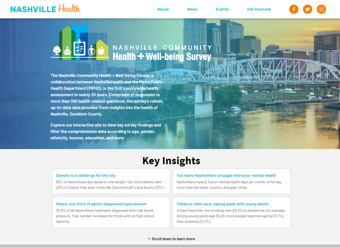
Of course, there are other applications for data stories as well. We have seen them used on community impact pages, annual reports, strategic assessment deliverables, survey summaries, status updates, and more. Below is an example of a data story in the form of a Web application our partner Juice Analytics created for the city of Nashville regarding its wellness initiative. (Learn about JuiceBox at https://www.kellerschroeder.com/JuiceAnalytics)
What about you? Are you reporting on the right KPI? Do your contributors know what to do if the numbers change? Do your dashboards and reports convey actionable insights that result in change? Are you clearly communicating your impact, value, and performance metrics to customers, prospects, and stakeholders? According to Forrester2, their research showed that only 29% of companies surveyed said they were effective at turning analytics into action. It gets better with practice. For more information on how we can help you turn your actionable insights into positive results, contact us at applications@staging.kellerschroeder.com.